
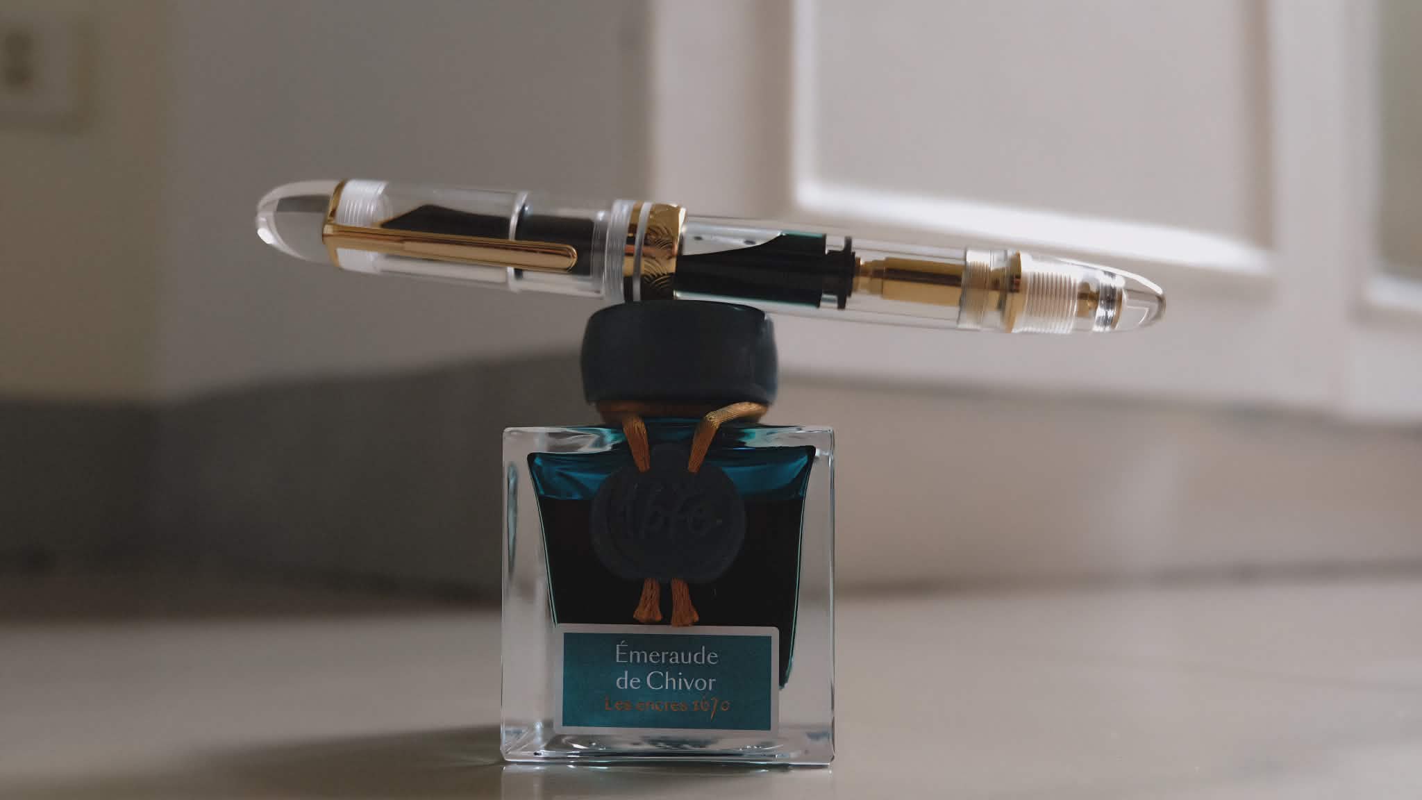
I’ve wanted Jacques Herbin’s Emerald of Chivor ever since I fell down the fountain pen rabbit hole.
You know how it goes. One minute you’re buying a perfectly sensible fountain pen for note-taking. The next minute you’re staring at ink swatches online at 2:00 in the morning, convincing yourself that your life would be significantly improved by owning a bottle of teal ink with red sheen and gold shimmer. Emerald of Chivor was that very ink in my mind.
It didn’t help that I kept seeing gorgeous swatches of it online. Then Drew Brown, back when he was still with The Goulet Pen Company, included it among his personal top shimmer inks. I even remember watching that video 3 times over the last two years. His video got me buying Diamine Shimmering Seas after the first time, one of my favorites among my ink stash.
The only thing that stopped me J. Herbin’s Emerald of Chivor was the price.
Now, before you raise your eyebrows and accuse me of suddenly becoming financially responsible, let me explain.
If you’ve been following my fountain pen journey for a while, you’d know I’ve spent more than twice the cost of this 50 ml bottle on a single fountain pen without losing a wink of sleep.
The issue wasn’t affordability.
It was prioritization.
Given the choice between buying a fountain pen and buying an ink, I will almost always choose the fountain pen. Pens are like puppies—I keep convincing myself that one more won’t hurt.
So for years, Emerald of Chivor remained firmly planted on my “someday” list.
Then fate intervened.
Or perhaps more accurately, a fellow fountain pen enthusiast decided to declutter.
Last week, someone posted a list of inks he was letting go, and there it was: Emerald of Chivor.
At half the original price.
Half.
I don’t remember blinking. I don’t remember thinking. I simply messaged him before someone else could beat me to it.
Fortunately for me, nobody had claimed it yet. He confirmed that it was an extra bottle and shipped it the very same day.
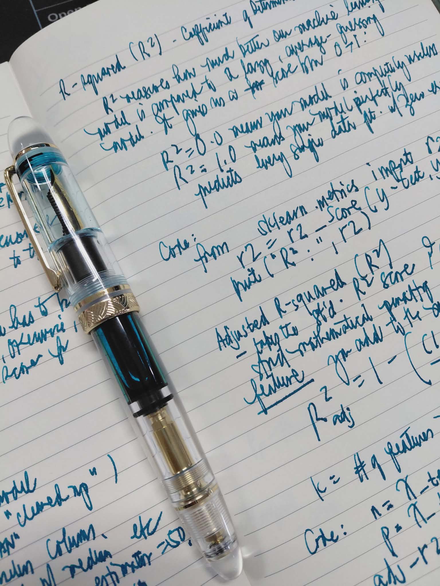
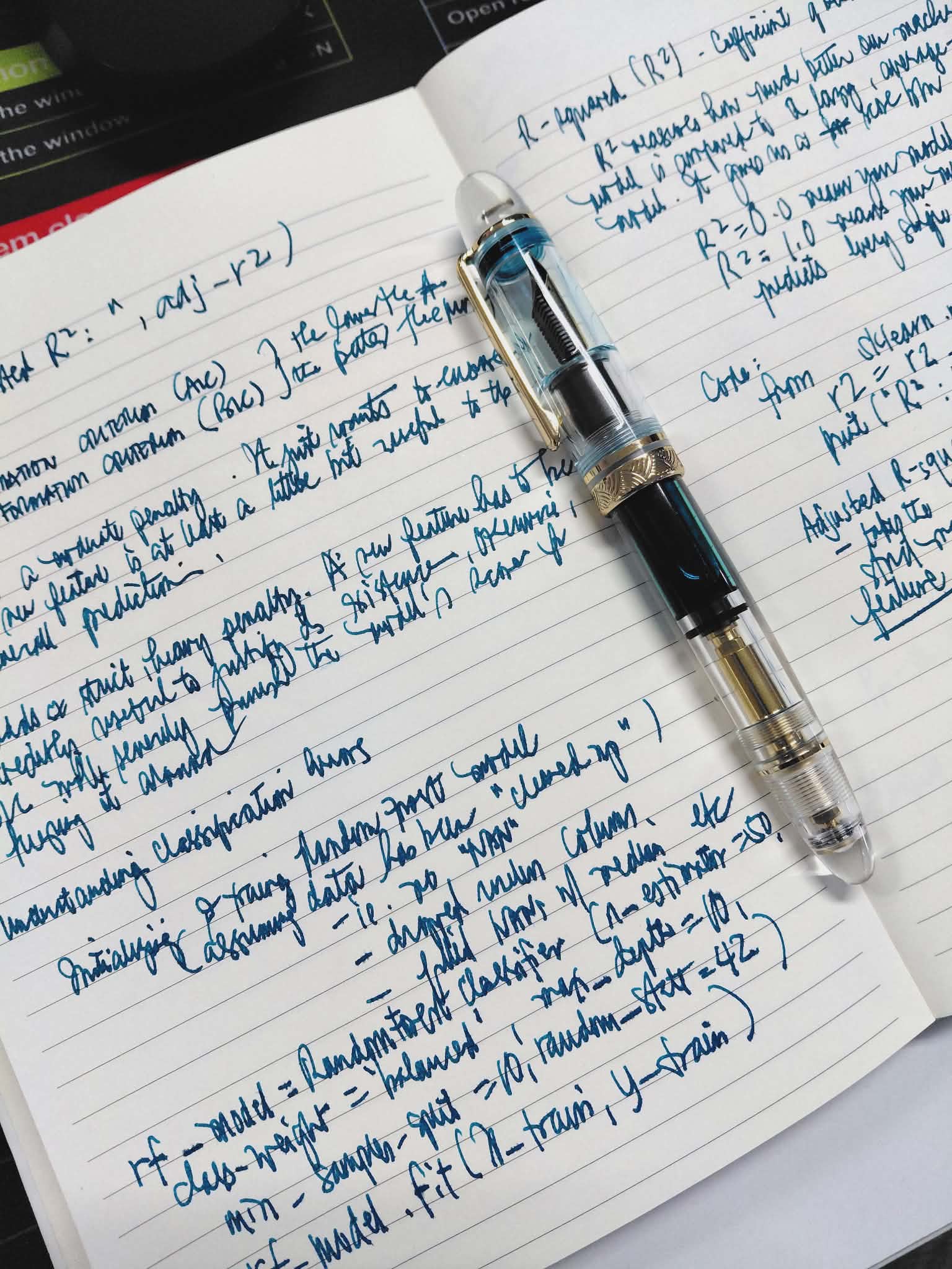
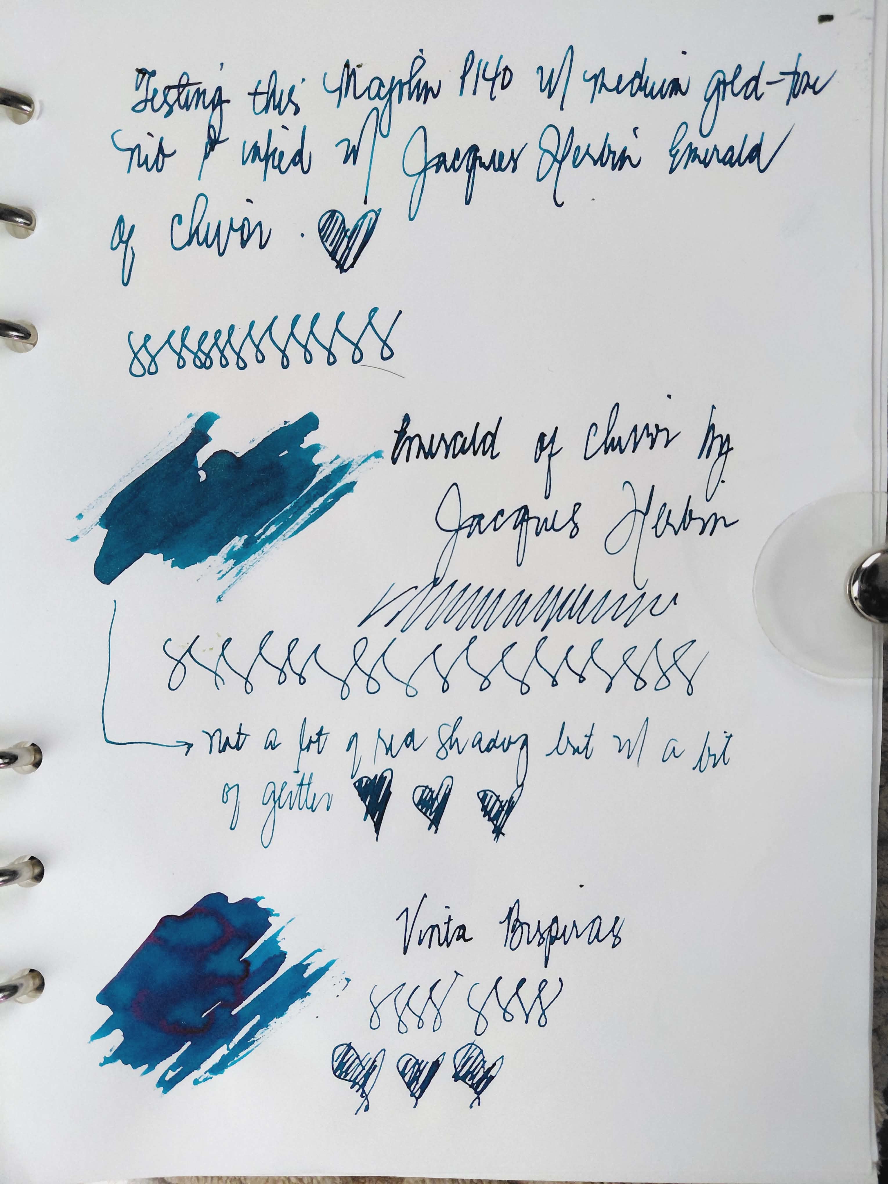
The moment it arrived, I grabbed my empty Majohn P140 demonstrator and filled it immediately.
Because if you’re going to use Emerald of Chivor, you might as well put it in a clear demonstrator where you can admire it like a jewel trapped in acrylic.
First Impressions
Emerald of Chivor is a fascinating ink.
At its core, it’s an emerald-teal color with red sheen and gold shimmer. The base color reminds me of Viridian green watercolor paint, except deeper, richer, and more dramatic.
This is not an ink for people who enjoy subtlety.
This ink enters the room before you do.
It’s also a very wet ink. In my experience, it showed noticeable ghosting on many of my fountain pen-friendly notebooks. The only paper that seemed completely unfazed was Tomoe River paper, which handled it beautifully.
If you’re planning to use this ink regularly, I’d recommend pairing it with thicker, fountain pen-friendly paper to get the most out of it.
Sheen, Shimmer, and Paper Magic
In large swabs, Emerald of Chivor reveals exactly why it has achieved near-legendary status among fountain pen users. The gold shimmer is abundant and eye-catching. The red sheen appears in irregular patterns, creating a beautiful contrast against the teal base color.
In actual writing, however, the experience depends heavily on your pen.
Using my Majohn P140 with a medium nib, the red sheen remains visible in certain areas, especially where ink pools slightly. The shimmer, on the other hand, is much more restrained than what you’ll see in giant Instagram swabs.
That’s not necessarily a bad thing.
The result is elegant rather than overwhelming. The ink still sparkles when the light catches it, but it doesn’t look like someone accidentally emptied a Christmas ornament into your pen.
Emerald of Chivor vs. Vinta Bisperas
I remember a fellow fountain pen enthusiast comparing Emerald of Chivor to Vinta Bisperas (Vesper Blue), and after using both, I can understand why.
In normal writing, the two inks can look surprisingly similar.
However, once you start making large swabs on Tomoe River paper, their personalities begin to diverge.
Bisperas exhibits stronger red shading and more dramatic color variation. It also leans noticeably bluer and brighter.
Emerald of Chivor, meanwhile, offers more shimmer and a deeper, more balanced teal. The blue and green components feel perfectly calibrated, resulting in a color that is rich without becoming overly saturated.
If Bisperas is a vibrant holiday display with all the lights turned on, Emerald of Chivor is the same celebration viewed through candlelight.
Both are beautiful.
They simply achieve their beauty in different ways. Photo below is my comparison of the Emerald vs Bisperas, swatched using my glass muddler by Dominant Industry so please excuse the handwriting.
Final Thoughts
Am I happy that I finally bought Emerald of Chivor?
Absolutely.
Am I even happier that I got it at half the original price?
Let’s just say that may have contributed significantly to my enjoyment of the ink.
This is a gorgeous ink in a gorgeous bottle. It’s wet, expressive, beautifully complex, and loaded with enough shimmer to remind me of Christmas decorations catching the light.
More importantly, it lives up to the hype.
After years of admiring swatches from afar, I can finally say that Emerald of Chivor deserves its reputation. It’s one of those rare inks that manages to be both visually stunning and genuinely enjoyable to use.
And thanks to a fellow enthusiast’s decluttering session, I was able to discover that without paying full price.
Sometimes the fountain pen gods smile upon us.
Discover more from The Fabulous Scientist
Subscribe to get the latest posts sent to your email.
